These post-course automations turn LearnDash course completions into a growth stream—for your learners and your…
The Magic Button
Wouldn’t it be nice to have a button that you can program to streamline your job? Just imagine getting a task done with one click where it used to take a few annoying steps to complete every single time.
The Uncanny Automator Pro plugin has the button for you. It’s appropriately called the Magic Button because it can do wondrous things from any page on your site. Here’s but a small sample of what’s in store if you have Automator’s Magic Button.
- Send an email notification to a manager, group leader, or an admin: A course participant can click on your Magic Button to flag a course administrator that the participant is ready for a review to proceed to the next course. There’s no need to fill out a form or bring up an email app. One-click is all it takes.
- Register for an event. Use a Magic Button to simplify your event registration process. Again, with one-click, anyone can register for your event without going through the trouble of submitting a form.
- Reset course progress (i.e., retake a course) or skip an optional lesson in a course. With the Magic button, you can provide your customers with a flexible and efficient learning experience. A Magic Button can empower course participants to redo something or even advance themselves to the next level with one click.
- Add yourself to a group of courses or remove yourself from a group that you no longer need to be a part of. Just think how easy it is to allow your students to press a button to add themselves to a set of courses or remove themselves from a group. It’s instant gratification and instant satisfaction. There are no extra steps or hoops to jump through.
This is just for starters. What’s even harder to fathom is, these huge time-savers aren’t doable today without Automator. Plugins like LearnDash, LifterLMS, bbPress, and the Events Calendar don’t provide any of this functionality through their shortcodes. Only Automator can do this in a click.
In other words, since the Magic Button is powered by the Uncanny Automator plugin, the Magic Button can run any set of actions supported by Automator!
In this article, we’ll first cover how the Magic Button works. Then, we’ll guide you through how to create one step by step, and how to use it. Before we let you go, we’ll give you some cool tips on how to style a Magic Button using custom CSS.
How the Magic Button works
The Magic Button integration is a feature of the Uncanny Automator Pro plan. The integration has two triggers; one that displays a clickable button and the other displays a clickable hyperlink. When a Magic Button trigger is created, Automator generates a WordPress shortcode. Shortcodes make it possible to place your magic button or link anywhere on a page or post.
This is an example of the Magic Button shortcode that Automator generates:
[automator_button id="27153" label="Click here"]Here’s an example of what the shortcode above would render for the browser to display:

Behind the scenes, WordPress works a little of its own magic. Browsers understand HTML—they don’t understand shortcode. When WordPress goes to render your page to a browser, WordPress will expand your shortcode into a longer version of valid HTML. The browser will see that HTML and then display a button that people can see and can click.
Creating a Magic Button
Creating a magic button is as simple as using one.
Step 1: Create a New Recipe
From your WordPress Admin Dashboard, navigate to Automator > Add new recipe. In the pop-up window that appears, select either Logged-in users or Everyone. (The Magic Button integration works for either recipe type.)

Step 2: Name Your Recipe
Give your recipe a name that makes it easy to recognize at a glance. For example, we’ve named this recipe “Magic Emails”.
Step 3: Configure Your Trigger(s)
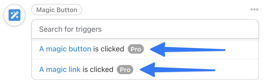
In the Trigger panel, from the menu of available integrations, select Magic Button.
The Magic Button integration has two triggers; A magic button is clicked and A magic link is clicked. (Note: If you selected the recipe type Logged-in users, then these triggers will specify a user clicking the button/link.)
Once you’ve selected a trigger, Automator will generate and display a shortcode.
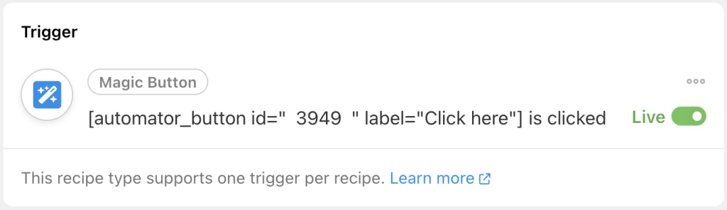
You can now copy the shortcode, including the square brackets [], and paste it into a shortcode block/module on any post or page on your WordPress website. Alternatively, if you do not want to leave the recipe editor, you can copy and paste the shortcode after you have finished drafting your recipe.
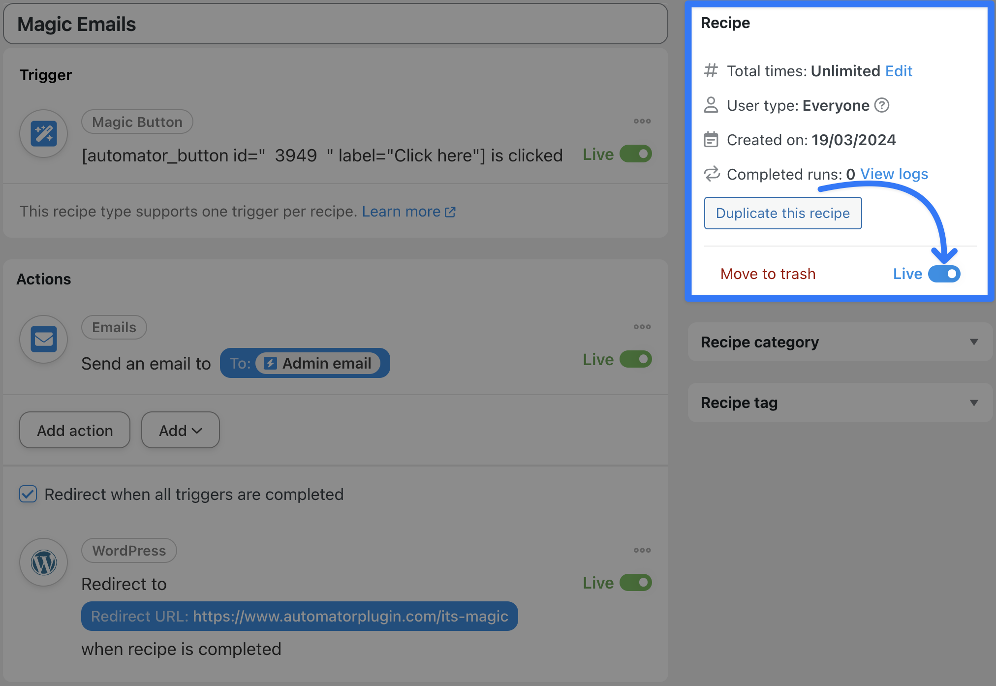
Step 4: Configure Your Action(s)
In the Actions panel, click Add action and select one of the integrations and actions. For example, we have selected the Emails integration with the action Send an email.
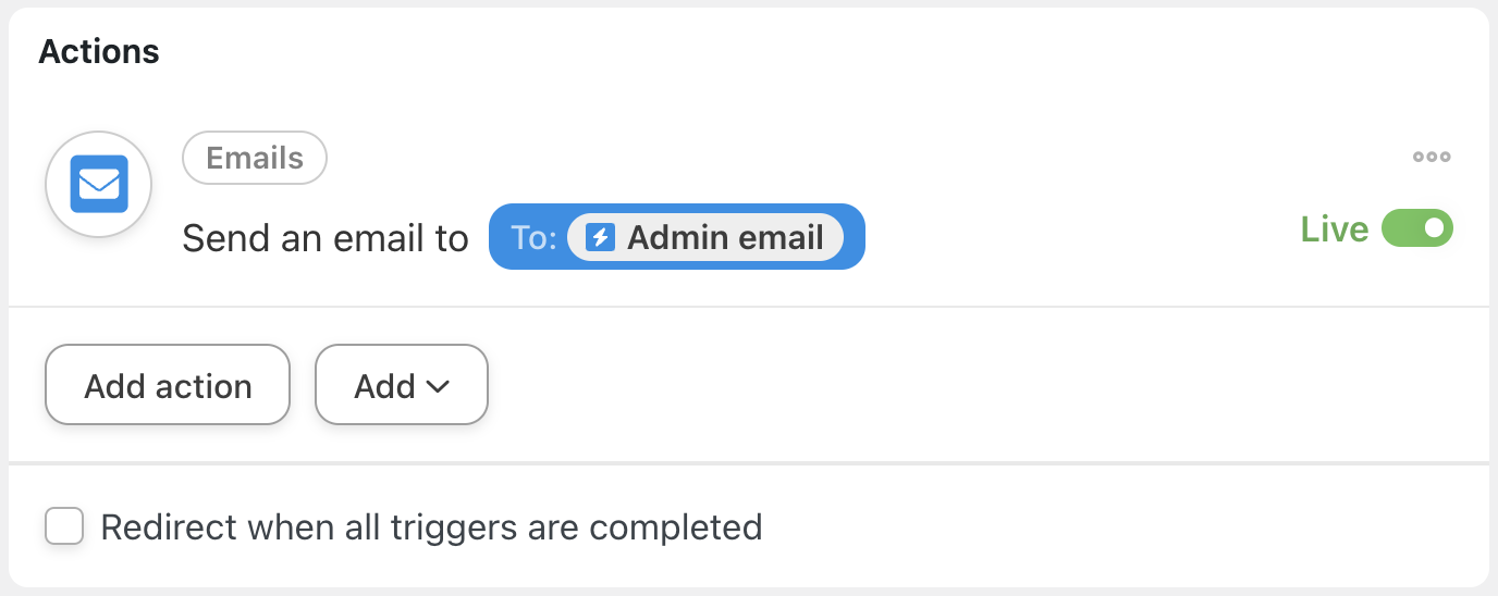
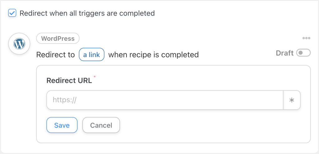
For a Magic Button recipes it’s good practice to check Redirect when all triggers are completed. Doing so will take your users and site visitors to another page of your choosing, giving them a clear indication that the Magic Button worked its magic (pun intended).
Step 5: Do a Little “Live” Magic
With your trigger(s) and action(s) configured, all that’s left for you to do is to pull a rabbit out of a hat. Just kidding. Simply, toggle your recipe from Draft and Live and sit back as you make Houdini proud.
Using the Magic Button
Once you have the shortcode to the Magic Button, you can add it anywhere in your WordPress page or post. Using the classic editor, copy the shortcode and paste it into the Visual or Text tab of the editor. Be sure to include the opening and closing square brackets [] just like in the code snippet below.
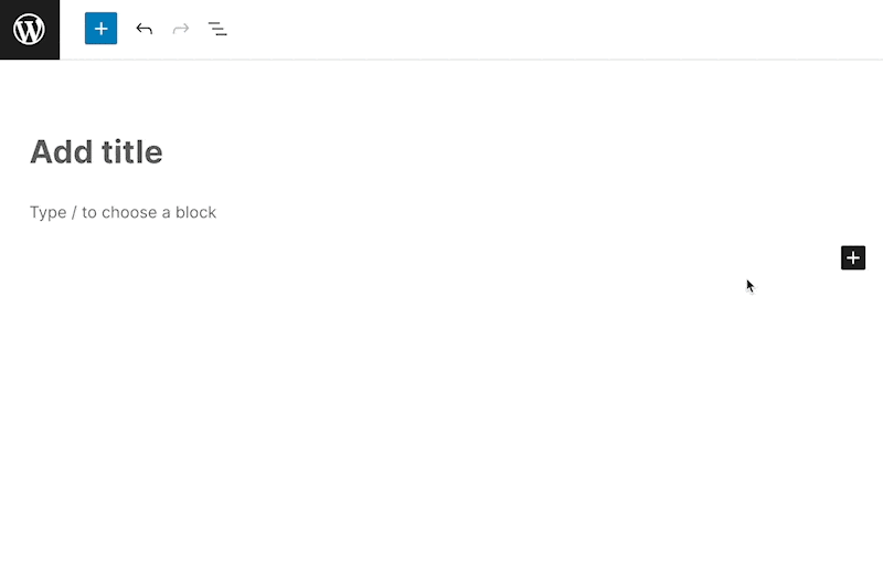
[automator_button id="3949" label="Click here"]If you’re using the Gutenberg block editor, add a shortcode block first, then paste the shortcode into the shortcode block.
How to style a Magic Button
In this section, we’ll show you how to style your Magic Button using CSS. CSS stands for cascading style sheets. CSS is the language for styling HTML. HTML is the language the browser understands for rendering a webpage. Another way to look at this is, a web page’s content is organised using HTML and CSS is used to make the content look good.
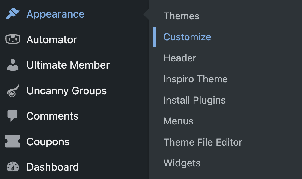
There are a few ways to add CSS to WordPress. For simplicity, we recommend that you use WordPress’s built-in Customizer. From the WordPress admin dashboard (/wp-admin/), navigate to Appearance > Customize > Additional CSS. This is where we put all the CSS used in the examples below.
A quick tour of CSS
Before diving into the actual CSS we’ll be using, let’s cover the basics. Feel free to jump ahead if you are already comfortable with CSS terminology and syntax.
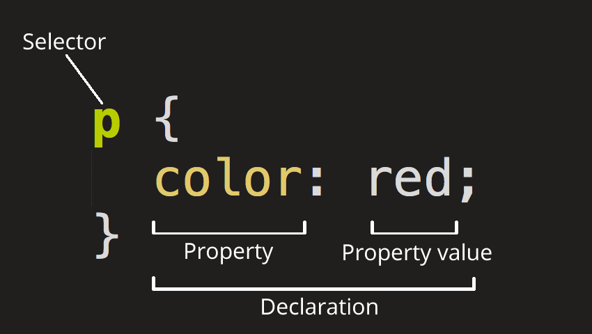
CSS is applied to HTML to make webpages look how they do. To apply CSS to HTML, we need to specify the following items for the CSS to work:
- Element selector: The element selector can be an HTML tag, a class (a group of things), or an ID (one unique thing). In this article, we’re only dealing with one class selector—the Automator button class.
- Rules: CSS rules have a property (aka name or attribute) and value. Here’s an example:
color: white;. In this example, color is the property and white is the value. Rules must be inside curly braces{}. A colon:must separate the property from the value. Each rule (property/value pair) must end in a semicolon;. The semicolon for the last rule is optional. - Target HTML: The target HTML is the HTML that is modified by the CSS rules we define. In this article, our target HTML must have the class name automator_button in its list of classes for our CSS styles to take effect. E.g.,
<button class="automator_button">. The Magic Button shortcode generates this code for us.
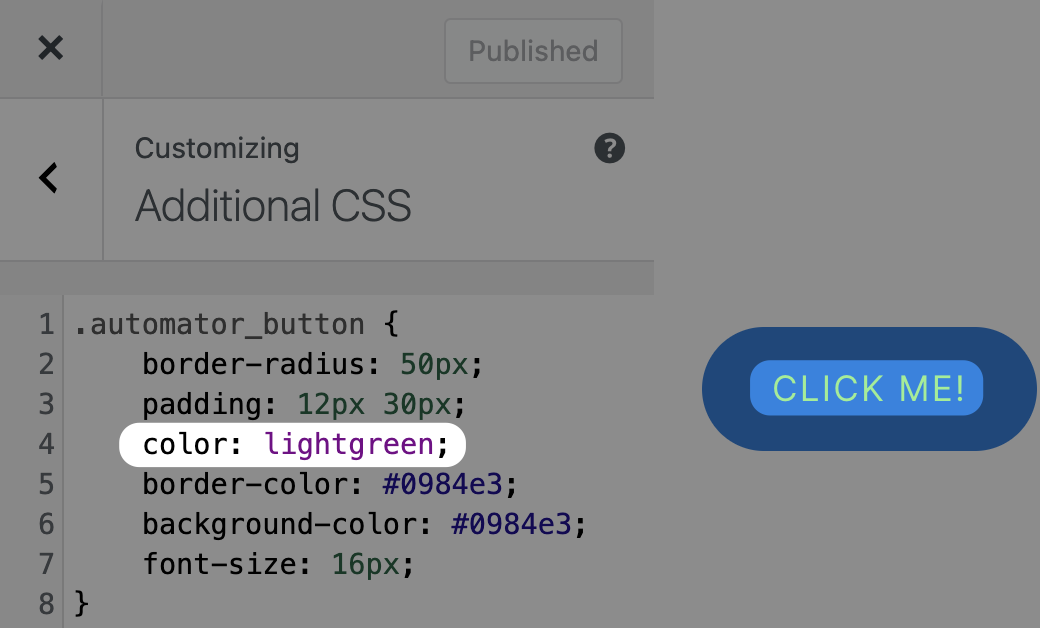
Default styles
Here’s what the Magic Button looks like by default on our Automator test site.

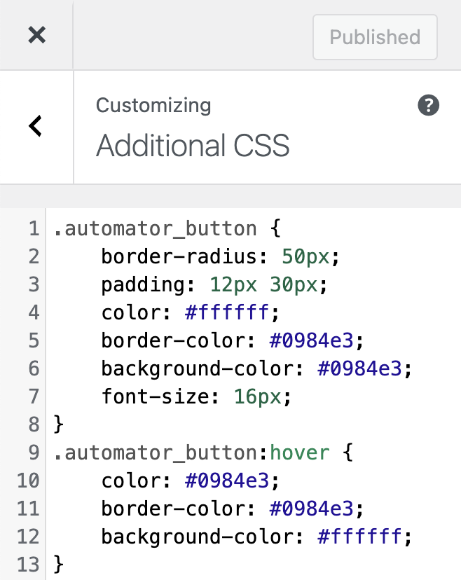
The CSS rules for this button look like this:
border-radius: 50px;
padding: 12px 30px;
color: #ffffff;
border-color: #0984e3;
background-color: #0984e3;
font-size: 16px;
To see what’s going here, let’s deconstruct each CSS rule that styles this particular button:
border-radius: 50px;This gives the button noticeably rounded corners so that the button takes on a pill shape. Lower pixel (px) values make the corners less rounded. Higher pixel values create more rounded corners.padding: 12px 30px;This creates space between the button text and the button border. In this case, there will be a little more than twice as much space to the sides of the text than the top and bottom of the text.color: #ffffff;This turns the button’s text colour to white.border-color: #0984e3;This makes the button’s border colour blue.background-color: #0984e3;This turns the body of the button to blue.font-size: 16px;This specifies the size of the button’s text. 16px is usually the default for browsers.
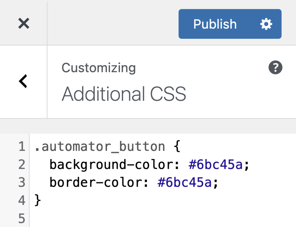
Button text colour
If you want to change up the text colour, you can update the automator_button class’ color attribute. Below is an example of using a web-safe colour name instead of a hex value. If we used the Automator green (#6bc45a), it would be harder to read because there isn’t enough contrast with the Automator blue. Hence, we’re going with the color: lightgreen to make the text pop just a bit more.
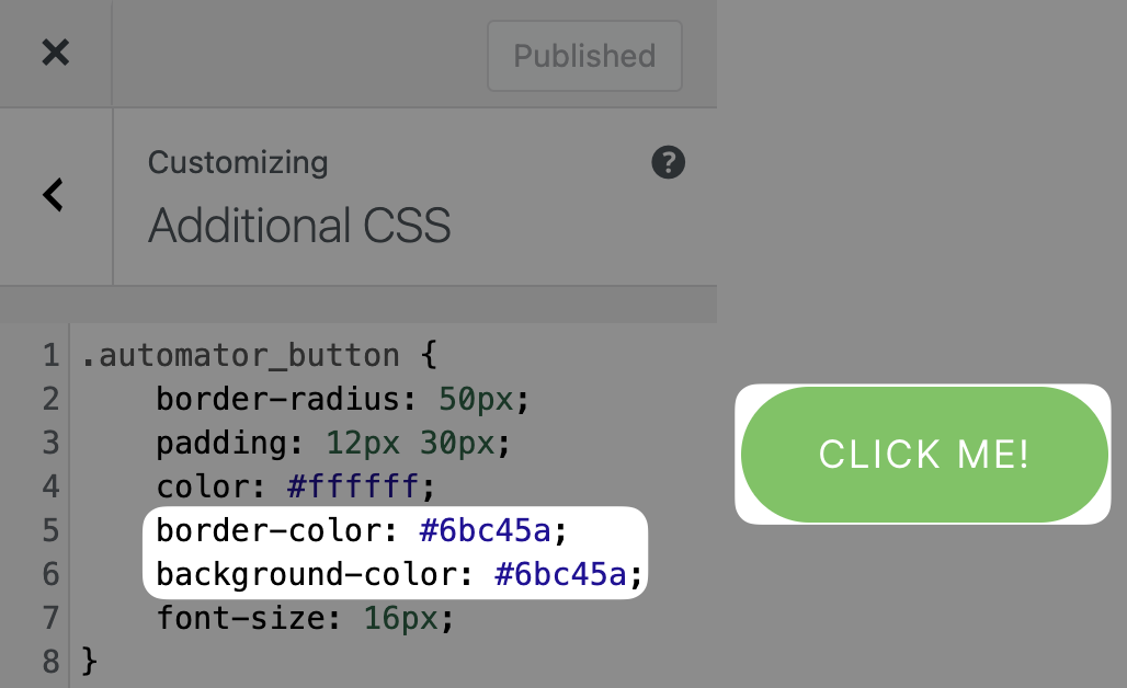
Button colour
To control the colour for the body of the button, you’ll need to change the property values for background-color and border-color. These colours can be the same or different. You can use hex values or colour names.
No rounding
If you prefer straight edges instead of rounded, change the border-radius property value to 0 with no units.
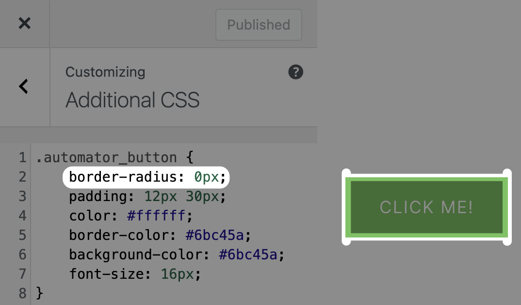
You can adjust the border-radius values to obtain softer corners with slight rounding.
Hover animation
Animating a button when a cursor or finger hovers over the button implies that your button is ready for action. It’s an encouraging cue for people to click.
To add a hover animation on your button, create a new CSS ruleset. This time you’ll need to add a :hover after your element selector (no spaces) as shown below. Then, add the rules to set the button’s colour to white while you set the button’s text and border colours to Automator blue.
Swapping the white on top of the blue from the original state to blue on top of the white creates an inverse effect during a hover over the button. This makes the animation jump out even more for attracting attention to your Magic Button.

Positioning using Gutenberg
WordPress’s block editor, Gutenberg, comes with a convenient Columns block that makes positioning other blocks a breeze. The example below shows how you can align your Magic Button on the left side, middle, and right side of a page.
All you have to do is add a 3-column Columns block to your page or post. Then plop your Magic Button shortcode into the column that works best for your layout design.
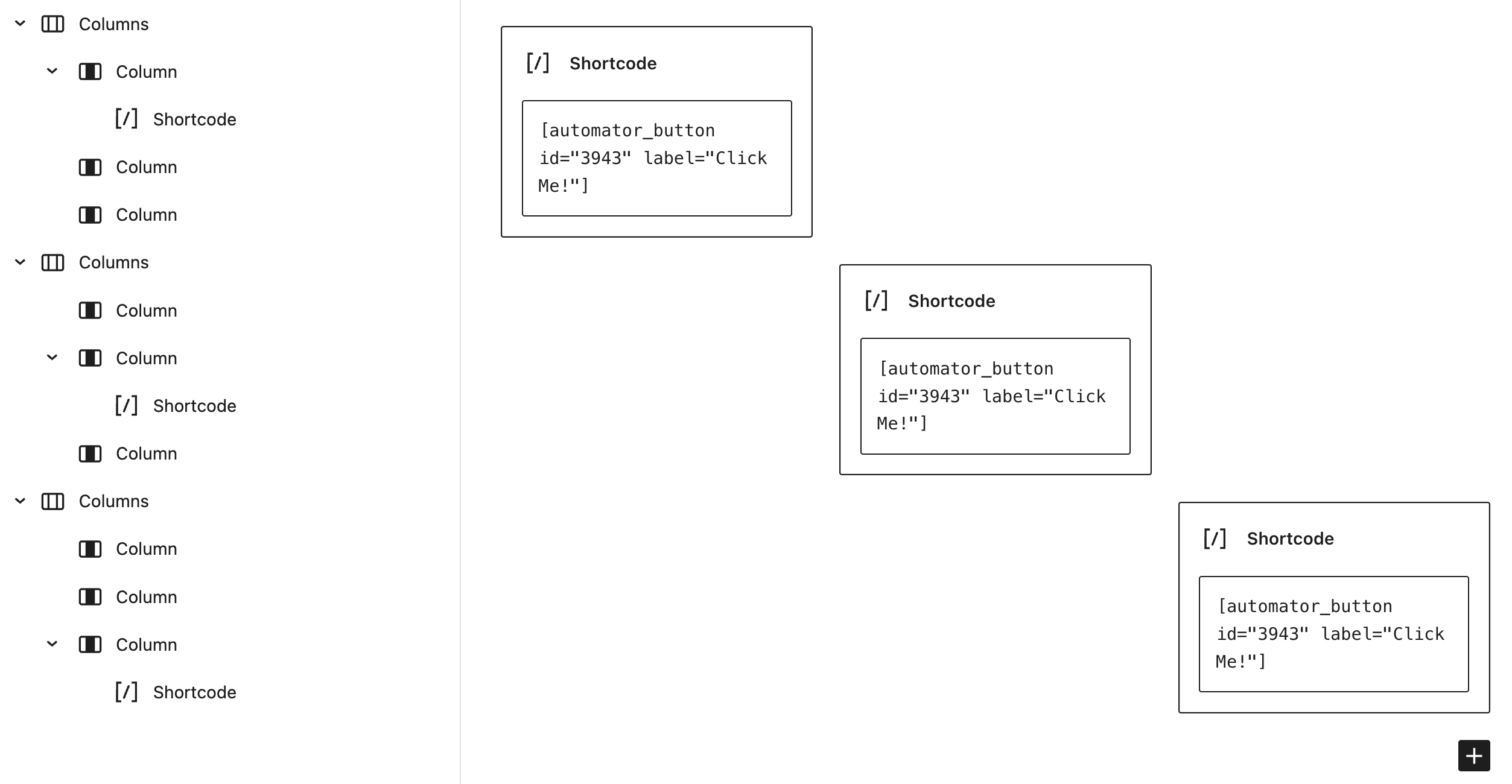
Here’s what you’ll see when you publish your Gutenberg page:

Positioning using the classic editor
Positioning objects using the classic editor is more involved. We’ll start with the HTML part first.
In the Text tab of the classic editor, you’ll need to copy and paste the Automator shortcode first. Then “wrap” the shortcode with an HTML div tag. In the opening div tag, you’ll assign a CSS class that we’ll define later. This class will be responsible for positioning the Magic Button. In the example below, we named the CSS class automator-button-container.
<div class=automator-button-container">
[automator_button id="3943" label="Click me!"]
</div>
Below is the CSS you’ll need to apply to the HTML above. Place this CSS in Appearance > Customize > Additional CSS. This code as-is will display the Magic Button in the centre of the page. Replace the place-items: center; rule with either place-items: center left; if you want the button left-justified. Or, replace the place-items: center; rule with place-items: center right; if you want it right-justified.
.automator-button-container {
  display: grid;
  place-itmes: center;
  /*
  place-items: center left;
  place-items: center right;
  place-items: center;
  */
  width: 100vw; /* Change as needed. */
  height: 100vh; /* Change as needed. */
Conclusion
By now, you are probably thinking of the Magic Button as your very own do-it button. We agree.
Furthermore, having this button is like saying, “Let’s get things done!” It’s a way to say goodbye to yet another intimidating form to fill out. It’s a way to say farewell to the precious time wasted on convoluted approval processes.
Instead, you can say hello to faster customer turnaround times, quicker time-to-market for your products and services, and glowing approval ratings from your audience because of the time you saved them. Remember this whenever a customer clicks on your Magic Button.
As Benjamin Franklin said, “Time is money.” We hope this article not only inspires you to create a Magic Button (or two—or three) but also allows you to reflect on how automation, in general, can save you money.
We think you’ll agree that the Magic Button is indeed a time-saver that lets you focus on what’s important. After all, shouldn’t you be spending more time running your business than on your website?

Related Posts


can this button integrate with elementor or Gutenberg button style?
so instead of using CSS I can use the button as I design on all of my website.
Interesting feature. This blog contains an error. The intergration to choose is not WordPress, but Automator Core.